A faster, more consistent Curri experience
Curri redesign: Built for speed, consistency, and scale
Good software gets harder to use gradually. A new screen gets built to ship a feature. A component gets recreated because the original wasn't quite right. Every decision makes sense in the moment, but over time, the product starts to feel like it was assembled rather than designed.
As Curri has grown, so has the complexity of what we build. More features, more teams, more surfaces. That growth is worth celebrating. But it also created inconsistency that adds up slowly. Nothing broken, just not quite at the quality we want it to be.
We believe the tools people rely on every day should feel considered. Functional, fluid, and beautiful. Not just complete, but coherent.
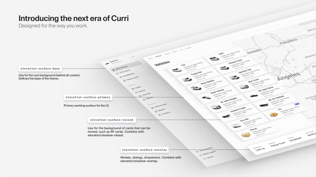
What we built
At the center of the work is a simplified, modern color and font system. Rather than managing dozens of one-off values, we defined a small set of core variables and let them do the work across every screen. The result is a product that feels polished and consistent whether you're booking a delivery, managing a route, or reviewing a dashboard. We also built dark mode, which has been a long time coming.
Alongside the visual system, we built shared components: every button, form, card, and screen element designed once and used everywhere. Design and engineering now work from the same building blocks. That alignment changes how fast we can move. Less time rebuilding UI from scratch. More time on the product logic that actually creates value for our Customers.
The "right time" to build it
A design system is unglamorous work. It does not ship a feature. It does not close a deal. It is easy to defer because the cost of not doing it is invisible until it isn't.
We chose to do it now because Curri is at an inflection point. The product is maturing. The team is growing. The Customers we serve are operating at a scale where every part of the experience needs to hold up. Building on a fragmented foundation would have made every future project harder and every future hire slower to ramp.
What comes next
This is a foundation, not a finish line. The design system gives us the infrastructure to build faster, more consistently, and with higher quality across everything we ship going forward. Hopefully, you will feel it in the product as the new look becomes familiar: a sense that things are where you expect them to be, that the app feels like one thing rather than many.
The team
I was lucky to work with an amazing group of people on this. Zayne Parmiter on design, Nich Dullam for some absolute wizardry, and Shawn Tompke for laying the foundations. Wayne Elgin, Neil Glazer, Barry Moore, and the rest of our talented front-end engineers who brought it to life.


